
Marvel Logo Evolution - Simplicity at its core
Overview and History
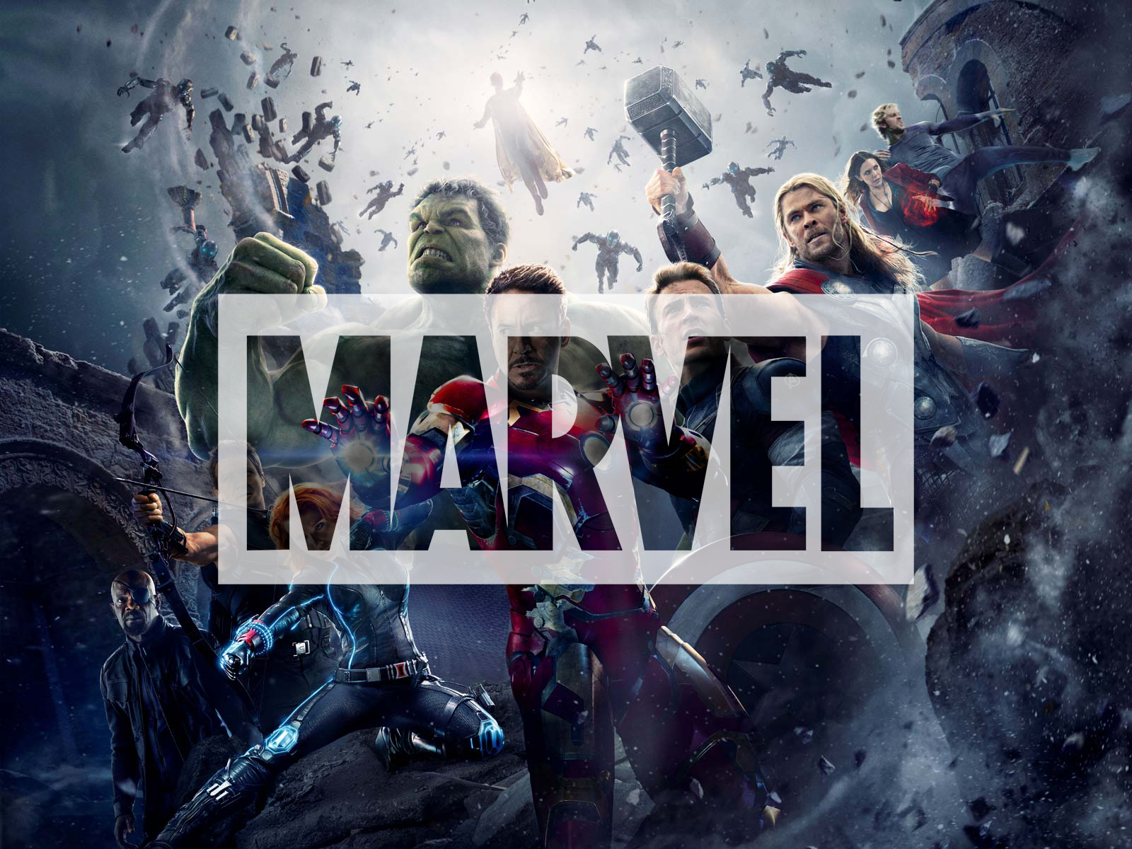
Marvel Studios has amassed an enormous fan base over the years and is arguably, one of the biggest comic book and entertainment industry brand today. With its 22 films grossing around $17 billion dollars, Marvel movies and their finely etched characters have created a deep rooted bond across generations. Whether it be a young toddler aspiring to be Iron man or a 35-year-old marvelling at the complexity of the character Thanos, the brand has fashioned a fiercely loyal audience.
Marvel was initially founded in 1939 by pulp magazine publisher Martin Goodman with its name as ‘Timely Comics’. It was started as a means to capitalize on the then novel trend of comic books, especially ones involving superheroes. In 1951, ‘Timely comics’ became ‘Atlas magazine’ as Goodman formed his own distribution company. Finally, in 1957, the company was renamed as ‘Marvel’.
The journey of Marvel was not all smooth sailing since its conception. Due to doubtful management decisions and a slump in sales, the company went into bankruptcy in 1996. However, it emerged from the same in 1998 and began to diversify its products catering to a larger demographic.
Logo Evolution
In 1939, Timely comics logo was in the form of an emblem with blue and white stripes, with the brand name written in a serif font. When the brand changed its name to Atlas magazine, the logo also completely changed. The new visual encompassed a globe with a sash surrounding it labelled as Atlas. Both these logo versions are vastly different from the current Marvel logo.

Post the renaming, the new Marvel logo consisted of an emblem type logo with marvel comics written in a circular fashion. Between 1961 to 1963, the comic books saw simple MC letters placed vertically. During 1963 to 1967, There were also different versions in which Marvel Comics group was written in different variations. There was no consistency in the logo across different comic books.

From around 1967 to 1971, a new version of the logo surfaced which used an electric orange comic-book font surrounded by illustrations of popular Marvel characters. From 1971 to 1990, a plain black letterhead which either said ‘Marvel comics group’ or ‘Marvel’ continued to be use

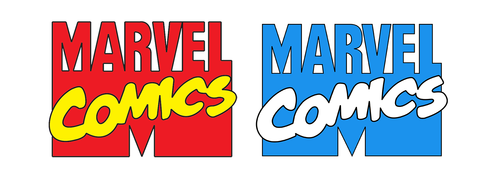
Post 1990, a colourful version of the Marvel logo persisted. It was a combination logo with the letter ‘M’ in the backdrop, with ‘Marvel’ in capital letters written on top, and ‘comics’ in a cursive font, written on the lower part of the letterhead. This version renewed the essence of a ‘comic book’ company with its poppy colours and casual fonts.
Current Logo
The earliest version of what Marvel logo looks as of today, appeared in 2002. The subsequent versions have been slightly adjusted to make the letters smoother; the most recent adjustment being in 2016 when the company became ‘Marvel Studios’. Each miniscule alteration over the years has contributed to the sleek modern look that the current logo exudes.
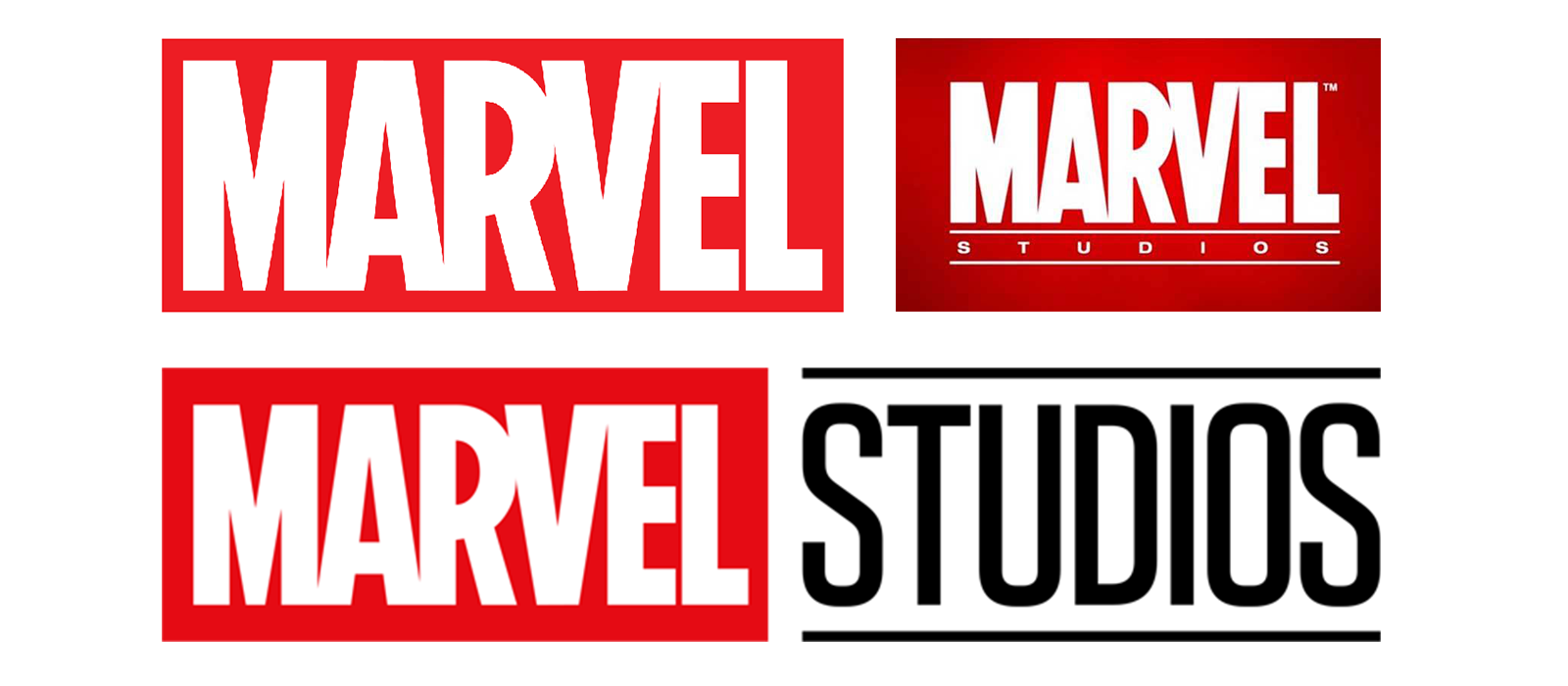
The striking combination of red and white has been sustained since nearly 1990. The vivid tone of red used aptly envelops feelings of righteousness and love, which continues to be the foundation of all the superhero characters and their narratives. The slight electric hue of red veers away the logo from looking exceedingly corporate and makes the white text pop out more.
The typeface used is quite similar to the font called Benton Sans Extra Comp Black. The regular version of the typeface was designed by Cyrus Highsmith and Tobias Frere-Jones. The crisp block letters with an elongated cap height create an aesthetic visual appeal.
The way the logo has been adapted and used in the introductory sequences of various Marvel movies is commendable. The fact that the form of the logo is so simple yet remarkable allows it to easily conform to different medias and aesthetics. The simplicity of the logo is slightly ironical considering the fantastical and flamboyant worlds that it represents. But perhaps, it could also reflect that underneath all the imaginative paraphernalia, the core narrative of Marvel is simple, relatable and righteous.