
Netflix UI/UX Evolution - Seemingly Simple

Overview and History
Netflix, like a sly devious worm has inextricably trickled into our lives to such an extent the term ‘binge watching’ is synonymous to ‘Netflixing’ in today’s day and age. It has single-handedly pioneered an era of streaming content online while veering away a huge chunk of the population from television and theatres. There are multiple factors owing to its magnanimous success, one of them being its highly responsive and personalized user interface (UI) and experience.
Co-founded by two software engineers Reed Hastings and Marc Randolph in 1997, Netflix initially started out as a movie and DVD rental website. Two years later, along with its pay per rental model, it also released a monthly subscription service. 10 years down the line, Netflix introduced the highly revolutionary online streaming service which has ultimately shaped the company to what it is today in a huge way. It continued to grow rapidly, expanding its base internationally, becoming available for multiple devices and even launching its own originals. Today, it is unflinchingly the biggest content streaming service in the world and is continuing to erupt exponentially.
UI evolution
Since Netflix started out as a DVD rental website, the initial interface was reminiscent of an e-commerce website. The screen was exceedingly text heavy with little to no images, no visual hierarchy and an incredibly cluttered and chaotic outlook. The colour scheme was purple and white which was very unappealing compared to today’s suave black and red. The interface was almost emulating the print medium with the column arrangement of information instead of a tabular one.

Online content streaming services were introduced in 2007 which understandably led to a subsequent UI change. In 2008, the landing page became more complex than the earlier one with an overload of information. With an intent to publicize their new services, the first page was bombarded with all the novel features.
Though the landing page was not up to the mark, the rest of the pages of the website were quite clean and straight forward. With clear distinct categorization of content, a search engine and introduction of features like recommendations based on history, queue of movies to watch etc., the user experience of Netflix was quite engaging. Though there was extensive scope for improvements regarding the aesthetics of the UI, it seemed to function well and exceeded expectations.
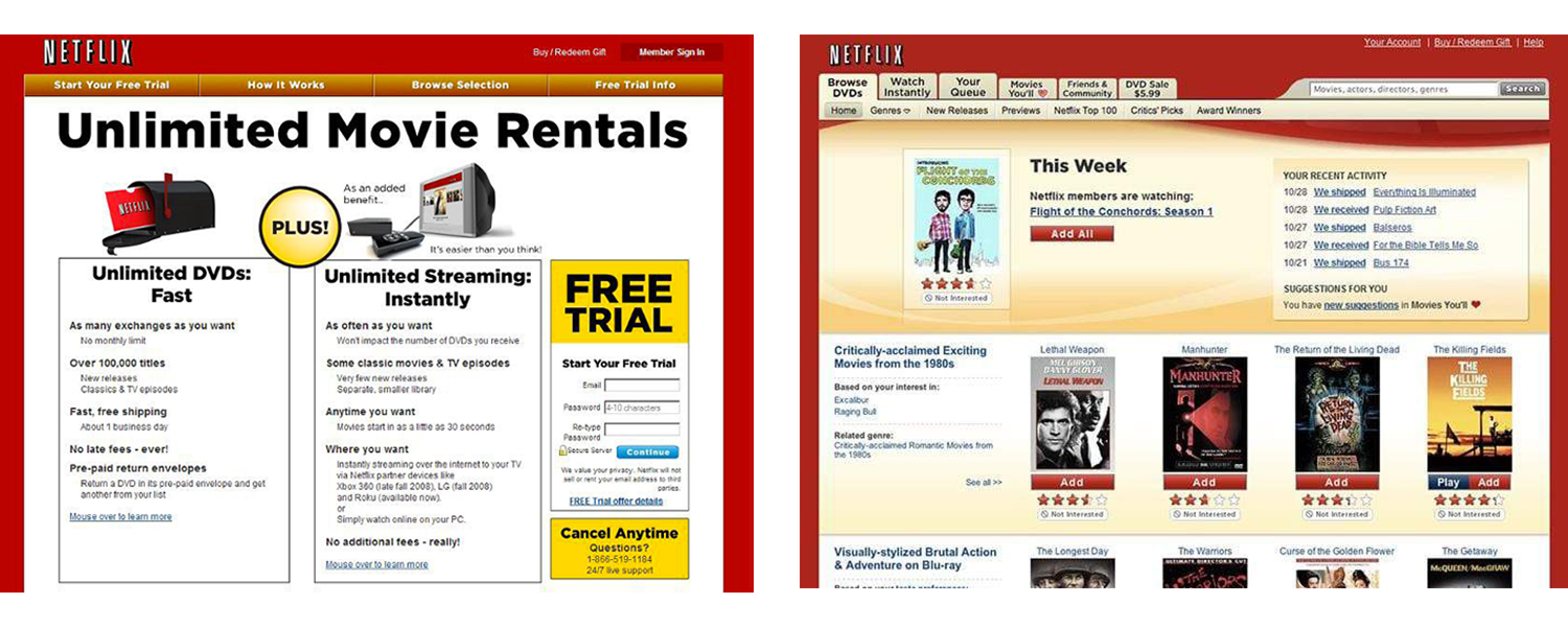
New developments occurred in the next couple of years when Netflix partnered with different companies such as PlayStation, Nintendo, Apple IPad, IPhone, Nintendo and other internet connected devices. There was an immediate requirement for the UI to be more responsive and engrossing.
Netflix, since the last decade, has dedicated an intensive amount of resources to enhance their design. A design team consistently conducts different tests and experiments to persistently improve their UI. In 2013, an eye tracking test revealed that the users were perplexed with the flow of information and did not focus on the details of the movie/show in the existing interface. This issue was tackled by simply shifting the text from the right side of the page to the top. This yielded better results regarding the flow of information and visual hierarchy which was proved by further testing.

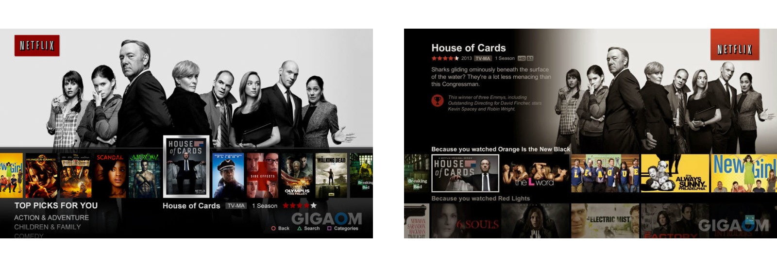
In order to utilize the availability of a vast variety of picturesque visuals at their hand, there was another major change in the interface. From the portrait posters which were synonymous with the print medium, Netflix now used landscape cover images. This was a very powerful alteration which enabled the home page to have a much larger impact. With a simple glance of a captivating poster, the user’s attention was snatched and then captured for a prolonged period of time via different inconspicuous features and UI additions. The image below on the left shows one of the earlier prototypes of this UI modification.
Current UI
The current user interface of Netflix is wonderfully seamless, intuitive and simply put, beautiful. The interface has been embellished with a plethora of features such as auto play, recommendations based on a particular series/movie watched, snippets of trailer being shown, match percentage based on how many people like it etc. Even the cover images are highly interactive and intensely engaging with small yet significant UI additions such as hovering on the cover image which unfolds extra information and trailers.
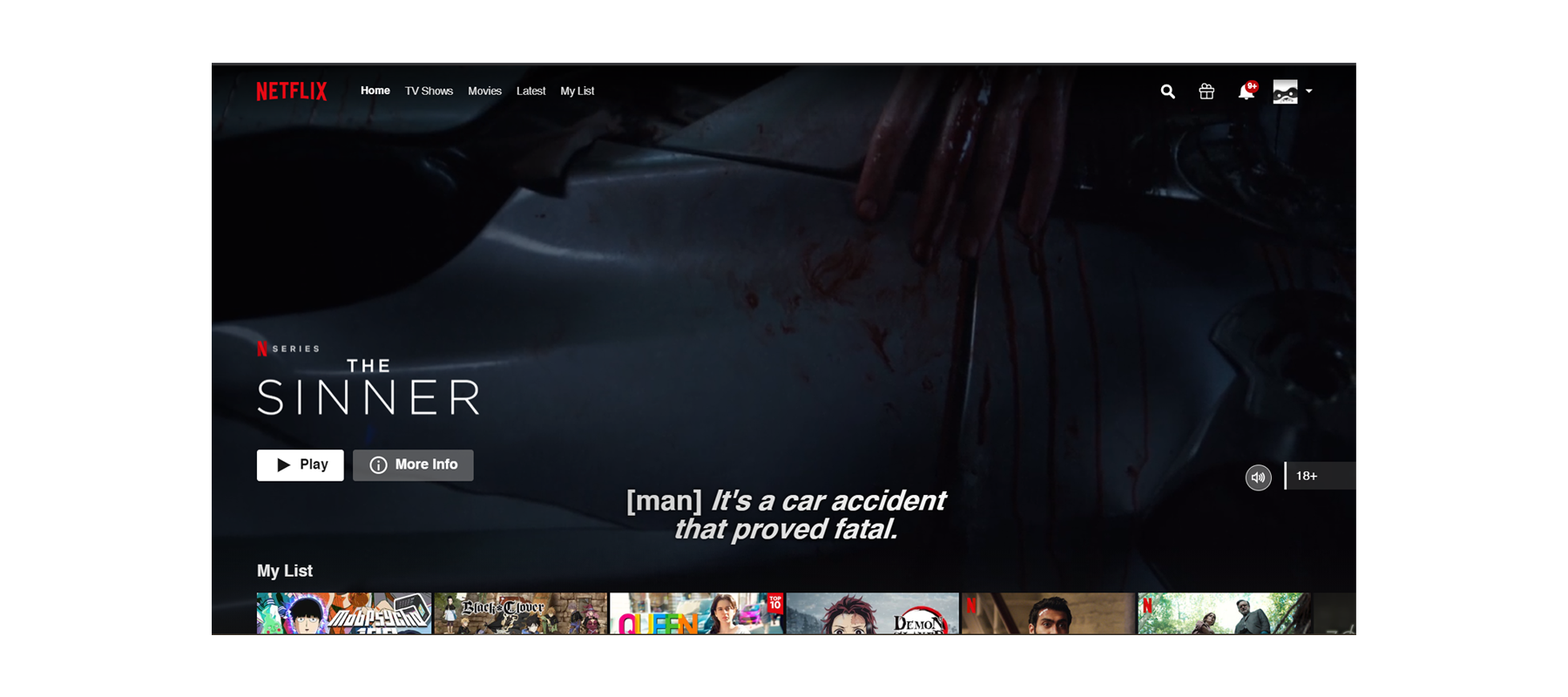
The beauty of the user interface is in the way all of the user-centered features are integrated in such a way that they harmoniously blend into the user experience. At first glance, there seems to be no complexity to the way the screen looks or its navigation. Many features such as the auto play was introduced after acute observation of user behavior and hence, became an instant success.

The seemingly simple interface of Netflix, in actuality, requires heavy deliberation, investment of time, resources and an incredibly strong design team. The whole model of Netflix is based on A/B research methodology which essentially amounts to testing two versions of a variable. After using qualitative research methods to generate UX ideas, nearly all of them are tested using A/B testing along with conducting surveys and ethnographic research. Furthermore, since the company is based on a subscription model, the success of UI/UX ideas is calculated via statistics of the subscriptions. If the users continue to enjoy the service, then it is a clear indication that something must be going right.
Though Netflix has an apparently exquisite interface, its design can seem ethically convoluted as it engages the user to a degree of immersion where the content seems to become immaterial. There have been some opinions surfacing which suggest that Netflix attempts to hide its shrinking and degrading quality content catalog behind the veil of a cunning UI. Some instances of the same are: the algorithm suggesting random categories on the home page, search engine being biased etc. Overall, while some of these features might be ethically ambiguous, the numbers clearly state that the UI/UX developments are clearly working wonders as Netflix fiercely continues to be the biggest content streaming platform in today’s world.