
Nivea Logo Evolution
It was in the summer of 2015 that I purchased my first Nivea tin. I had started to look for sustainable options for products in the market and that began with limiting my purchases to products that came in biodegradable or 100% recyclable packaging. Nivea, since it was the only cream at the time that came in a tin, was an immediate choice.
When I began using it, I noticed that the cream felt like it had a cream base and some water in it. I learnt that this was Eucerit, a substance that acts as an emulsifier and combines oil and water into an extremely fine, stable mixture. Dr Isaac Lifschütz had developed this completely new emulsifier by 1911. This is what began my research into them and it gradually became a foray into their history, their legacy and the evolution of the brand’s packaging.
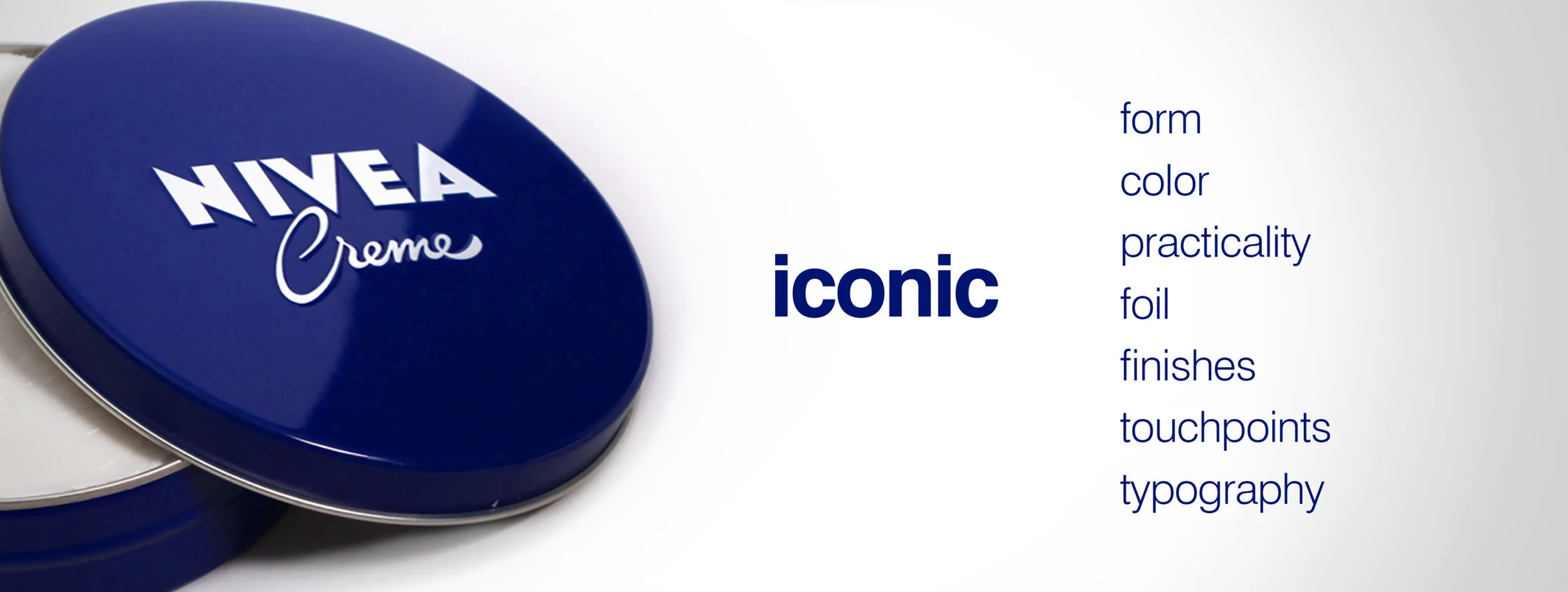
Nivea is a brand thats more than a 100 years old. Their hallmark has always been the tin, which is a clear remnant of a time before plastic when even biscuits would come in beautifully floral tin boxes. The first blue Nivea tin made its debut in 1925. By the year 1935, Nivea has been rebranded to have the modern identity it sports till today. The serifs were removed and the sharp corners were brought into the logo. Over the years, the Nivea Creme tin went through many microscopic design changed until it was finalised in 2007 with the brand’s name and the word ‘creme’. Simple, iconic, unique.

The brand approached Yves Behar for a redesign in 2007. The rework emphasised the colour blocking that is recognized by most consumers immediately. The logo was decided upon as the singular mark for all their product categories across the board. The minimally bold logo allows for a strong presence on any shelf its placed on and provides the brand with a visual prominence almost immediately. The choice of the shape, a circle that holds the logo within its center is pleasing to the eye especially because of the rework on the cream’s bottle caps. Yves Behar’s team redesigned the bottles to have a sloping, angular bend which lends to the idea of working an aspect of humanization into the product.


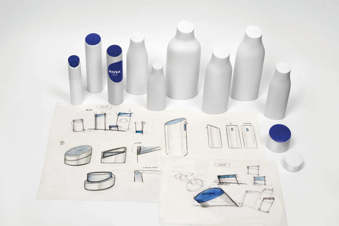


Material reduction and sustainability has been a key tenant throughout the design process in close cooperation with the NIVEA team. The reduction of bottle and packaging shapes created new efficiencies within the company. At the same time, the geometry of the new design allows for improved functionality and less material used overall, by up to 15%. The weight reduction of the packaging is combined with a label reduction of 23% (by switching to a different material and liner). The bottles were optimized for shipping, packing tighter and saving 12,600 pallets and 585 tons of CO2 per year. This contributed to the overall 2020 goals of Beiersdorf to reduce their carbon footprint by 30% per product. In addition, all materials used are fully recyclable and all formulas have an average of over 80% non-fossil ingredients.