
Pepsi Logo Evolution - Constant Re-envisioning

Overview and History
A glass of refreshing Pepsi on a stifling hot day can rejuvenate and revitalize anyone from a cranky teenager, or an exhausted mom. While Pepsi may have built an enormously stable empire in today’s world, the trajectory of its logo has been incredibly dynamic and slightly volatile.
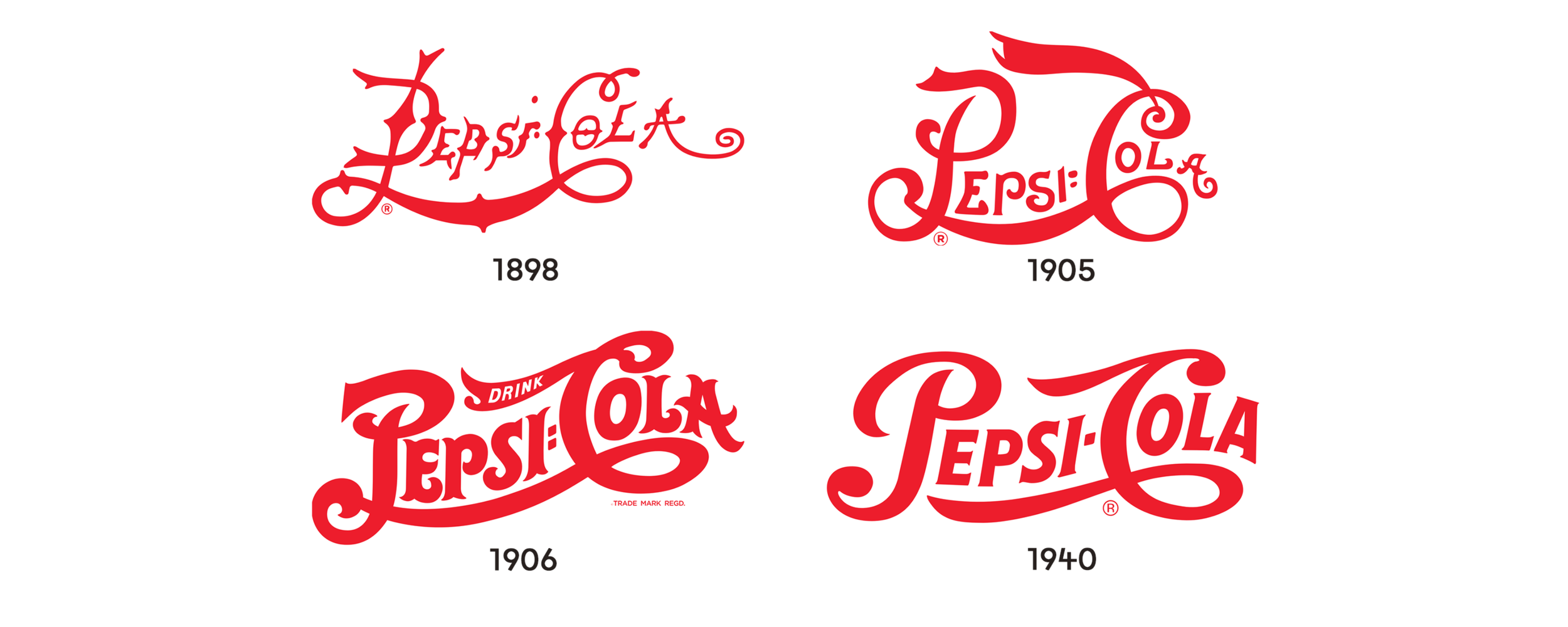
It all started in 1898 when a pharmacy owner named Caleb Bradham started selling a beverage called ‘Pepsi Cola’, known earlier by the name of ‘Brad’s drink’. This medicinal drink had two main ingredients which were pepsin, a digestion enzyme and cola nuts. In 1903, the name was officially trademarked and the company skyrocketed with a sale of 20,000 gallons of Pepsi Cola syrup in a year. Since then, the brand has grown manifold to become one of the biggest beverage brands prevalent today.
Logo Evolution
The first ever logo of ‘Pepsi Cola’ in 1898 was in a fiery red spiky typeface which looked handwritten. With protruding pointed edges, the letters ‘C’ and ‘P’ connected and a colon between the two words, the logo looked quite eccentric. In 1905, the logo turned smoother, the spikes were glossed over and the font became thicker. The very next year, there was another revision wherein the thickness of the font increased even further and the word ‘drink’ was appended. The next major change in the visual occurred in 1940 when the lettering became even more smooth and flowy, looking much more legible and modern compared to the first iteration in 1898.
The vibrant hue of red used in the logo symbolized the overarching brand essence of Pepsi Cola which was about radiating energy and fun. The drink, initially intended as a medicinal drink was supposed to exude youthful bubbliness. This feeling was portrayed through the zestful shade of red.
The next wave of changes that occurred to the logo involved the addition of a circular element to the logo which first occurred in 1950. The visual now encased the illustration of red, white and blue serrated bottle cap. The inclusion of colours of the American flag was a way for the brand to show support after the second world war.
The next wave of changes that occurred to the logo involved the addition of a circular element to the logo which first occurred in 1950. The visual now encased the illustration of red, white and blue serrated bottle cap. The inclusion of colours of the American flag was a way for the brand to show support after the second world war.

Another major change occurred in 1962 when the word ‘Cola’ was dropped from the brand name. Furthermore, the lettering also changed from the conventional swoopy typeface to a flat bold one. In 1973, the same logo turned completely flat as the bottle cap was abstracted into a plain curvy circular shape. The typeface turned into a rich shade of blue which continued to be the same, while being italicized even when another revision occurred 18 years later. This version saw a rearrangement of all the elements of the logo to create a much more pronounced and bold version. The wordmark was shifted to the top, the globe to bottom right and a solid red strip was added to the bottom.

Given the previous track record, there were inevitably another set of changes that occurred in 1998 and 2003. The colours of the background and the text were reversed. Depth and gradients were added to give the logo a livelier feel. The modifications done in 2003 seemed like the designers were experimenting to enhance the three dimensional look making it look somewhat effervescent.

Current Logo
The first version of what the logo looks like today was released in 2008. The company splurged more than a million dollars to design it. Channeling the ideas of the golden section, Earth’s magnetic field, gravitation, feng shui etc., the novel logo looked intensely modern, clean yet familiar.

The ball was redesigned to replace the curvy white line to an angled swoosh, along with changing the typeface of the wordmark to a round sans-serif font. There were varied responses to the logo. While some people denounced it as pretentious, others were engrossed in decoding the secret messages and meta meanings that the seemingly simple visual enveloped.
It is quite commendable how the logo of Pepsi has incurred a vast number of changes over the years yet still has maintained a sense of familiarity and continuity. This has been beautifully achieved by using the same signature colours and shapes. The logo is distinctly recognizable in any form or version. It is quite fascinating that the brand has not conformed to the logo envisioned a century back and has persistently updated it with the changing times, yet preserving the core brand essence.