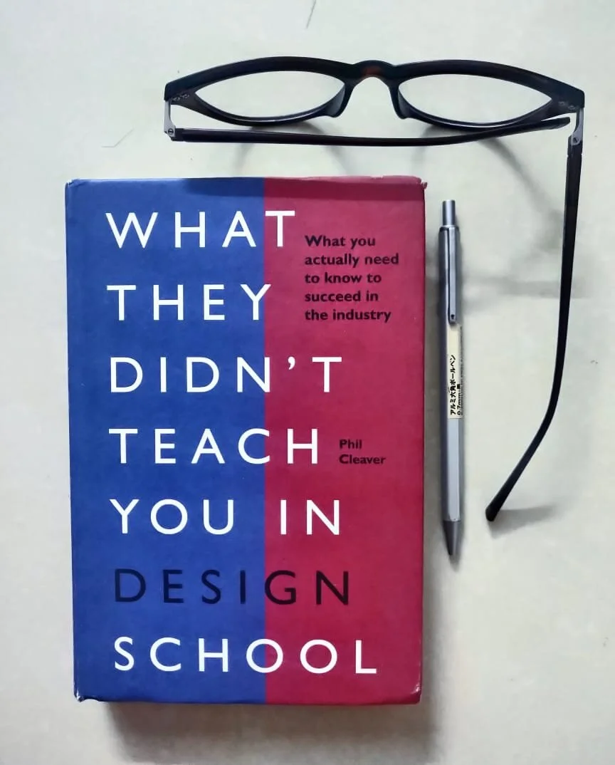
Review: What They Didn’t Teach You In Design School
There are more design students entering the job market every year than ever before. As a young designer myself, I was confused about the path to choose for a few weeks before I decided to begin my foray as a professional by working under the guidance of my industry seniors.
My first experience as a professional was not a pleasant one. Apart from the issues of companies not processing payments on time, slowly, there emerged multiple problems that I wished I’d been taught about when I was receiving my design education. As I added months on my work experience, I decided to maintain a separate list of things I wish someone had taught me before I joined the industry. Over the course of two years, this list had 187 things I wish I’d been taught before I became a professional.
This year, I decided to tie my loose ends as a professional designer. I took it upon myself to observe my workflow, my deliverables, myself as a brand and polish up the edges that didn’t feel professional enough to me. Once I undertook this task, I started going through all my work journals from college and in its margin, I found a name scribbled with large, capital letters with arrows pointing towards this name - What they didn’t teach you in design school: what you actually need to know to succeed in the industry by Phil Cleaver.
This year, in April, I purchased the book. To say that its taught me more than I ever learnt being a design student would be an understatement. I doubt that there’s been many real-life experiences that have taught me as much as I learnt from this book in a matter of hours. For one, this book makes you look at yourself in a way you just dont when you graduate. It teaches you industry behaviour you’ve already began to notice and then some. Phil Cleaver has condensed the lessons of his design career and his lifetime into this book which is a beauty to read.
The book begins by him walking you through the entire process of getting recruited as if you’re experiencing it in real time - from advice to preparation to definite questions you must ask - he covers every doubt a student could have. It addresses concerns we didnt realize we should have had when he started sending our applications.
“Portfolios are to be packaged as design jobs.”
A perceptive shift I experienced right at the beginning of the book was the treatment of resumes by us, as designers. Cleaver talks about the communication gap we often tend to overlook when applying for jobs becomes the norm and that is the lack of the person present physically in todays’ work environment. He talks about the need for our resumes to try and convey the kind of a person you are. Make the whole (you) greater than the sum of its parts (your resume and portfolio). He hints towards making yourself a gestalt and this is something that most resumes today lack in. This kind of dehumanisation, especially over online modes of communications needs to be addressed in our work, and this book reminds you of it in the very beginning.
“Your resume needs to be viewed as an integral part of your visual campaign.”
After that, it covers a design fledgling’s resume, portfolio and interview presentation, it moves towards brushing the skills we’ve been taught endlessly - type, typesetting, grids amongst many others. The next topics covered were my eureka moments with the book - It guides you through the varied and expanding roles of the modern designer, how to fit into and pour out of them and the ways in which one must resolve conflicts with other designers. This is where I learnt the most. As per the reviews I read online, the book was outdated with some useful advice but the book’s been updated enough to cover web designing and software skills. It addressed the changing roles of a modern designer and thats something I have never come across in such a direct explanation of it. Its a clear, concise book thats filled with quips and a witty narrative that also reaches out into the topics of collaboration with sister-industries. Marketing, Internet Etiquette, Working with suppliers and print production are the other topics covered in it.
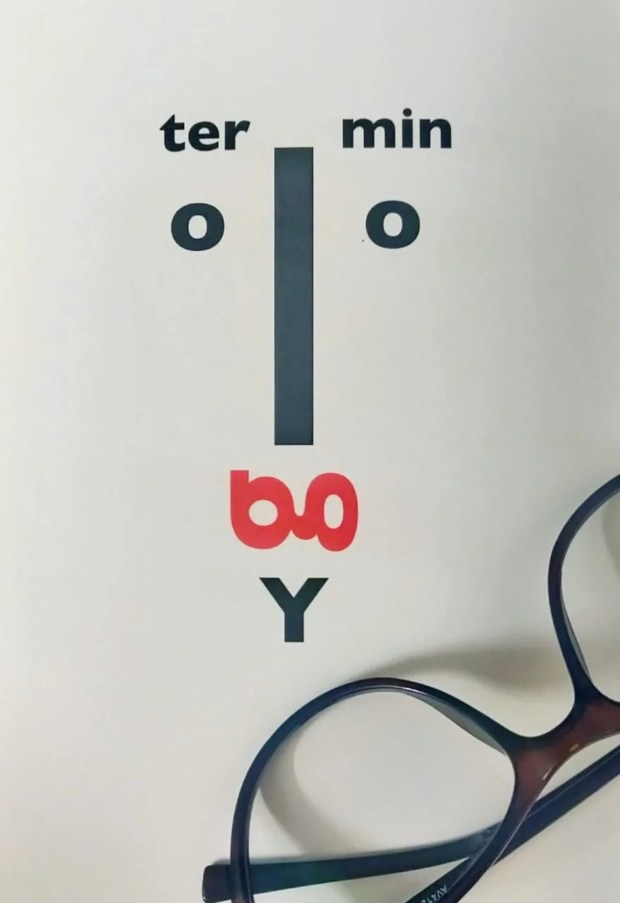
There’s much that you’ll already know, if you’ve been working professionally for over a year but even then, there’s little Easter eggs waiting around. If not for anything else, then this book is worth the money for its beautiful typesetting, aesthetic presentation and sporadic but plentiful anecdotes peppered all over the book by design geniuses. I learnt to build myself up as a designer and where to place myself based on my skills - a kind of targeted self-analysis that helped me in more ways than one. One of the things that stuck was something obvious - that everything you do visually, is a part of your skillset and therefore needs to be treated like a major design job. Thats a valuable perspective shift to have - it essentially means that you live every second as a designer, and Im glad for this book to have made that understanding stand out for me.
About Phil Cleaver: He is the protégé of Anthony Froshaug. Phil Cleaver honed his design and typographic skills under Alan Fletcher at Pentagram, Wim Crouwel at TD in Holland, and Michael Wolff at Wolff Olins. Phil is a fellow of the Chartered Society of Designers, a founding trustee of The Monotype Museum, a Fellow of the Royal Society of Arts, and Professor in the Creative Industries in the School of Art and Design at Middlesex University. His book design is in the permanent collection of the V&A Museum’s National Art Library.


